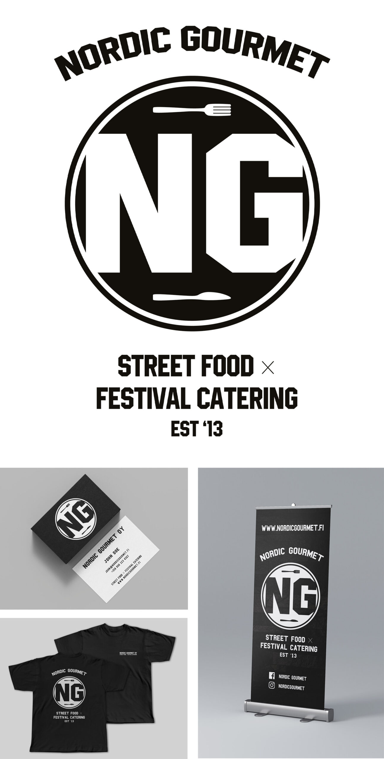
Logo design for a Finnish street food and festival catering company that wanted to update their previous, outdated logo, to a new more modern and cleaner version. Company is referred as the two letters from their name, N & G, so we wanted to incorporate those to the logo as the main element instead of the full name. From previous design, company wanted to keep the circular design, so we decided to keep that and add the fork and knife to represent the food industry.